
Albers versus Itten
What was the context for the publication of "Interaction of Color" in 1963?

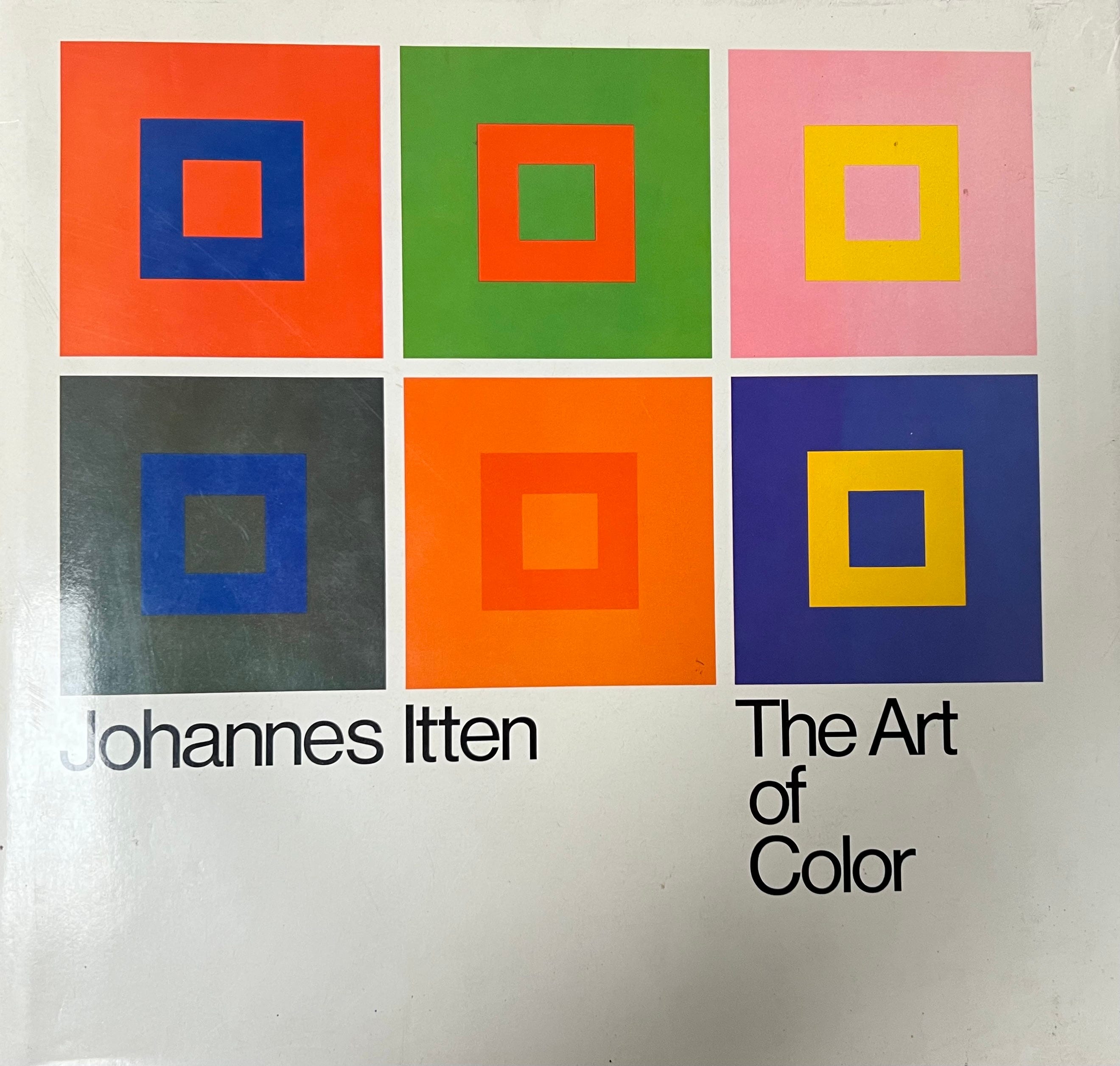
Context is everything, right? That’s the big broad message of Josef Albers’s paintings and teaching. Everything from a color to a personality to a book has a context. When the context changes we often experience the color, personality or book differently. It’s interesting to ask, what was the context when Albers was finalizing the design of his revolutionary color theory book, Interaction of Color? An interesting discovery I made during my residency at the Josef and Anni Albers Foundation in 2007 might shed some light on this. It’s a discovery that implies a significant connection between two of the most famous color theory books of the 20th century, The Art of Color, first published in German in 1961, and Interaction of Color, first published by Yale University Press in English in 1963.
Let me back up for a moment. Around 2000-2002, I was mostly painting outside, on location, in Italy, France, California and New Mexico. I kept noticing how a color would look one way on my palette and then look another way when I painted the color into my painting. I was trying to find new ways of using color as a means of seeing better so I could make different kinds of paintings. About this time I had a harsh meeting with Wayne Thiebaud’s dealer, Allan Stone. I took a carload of paintings to Allan’s house in San Francisco in 1999. (I’d been in touch with his gallery ever since I was a student at Parsons in 1988-90 and I hoped to show there.) Allan liked my paintings but said he couldn’t show them because they had too much “reportage”. That critique stung. It preoccupied me for a while but also made me more determined to better understand color.
I bought both Itten’s Art of Color and Josef’s Interaction of Color in March, 2001. I was determined to better articulate the phenomena of color behavior I was observing. My goal was not to destroy the magic of color behavior but to move deeper into the mystery. I was convinced that with a more precise language for discussing color phenomena, I could negotiate more intuitive, creative uses of color. I had a hunch I would gain freedom through more advanced knowledge of color behavior.
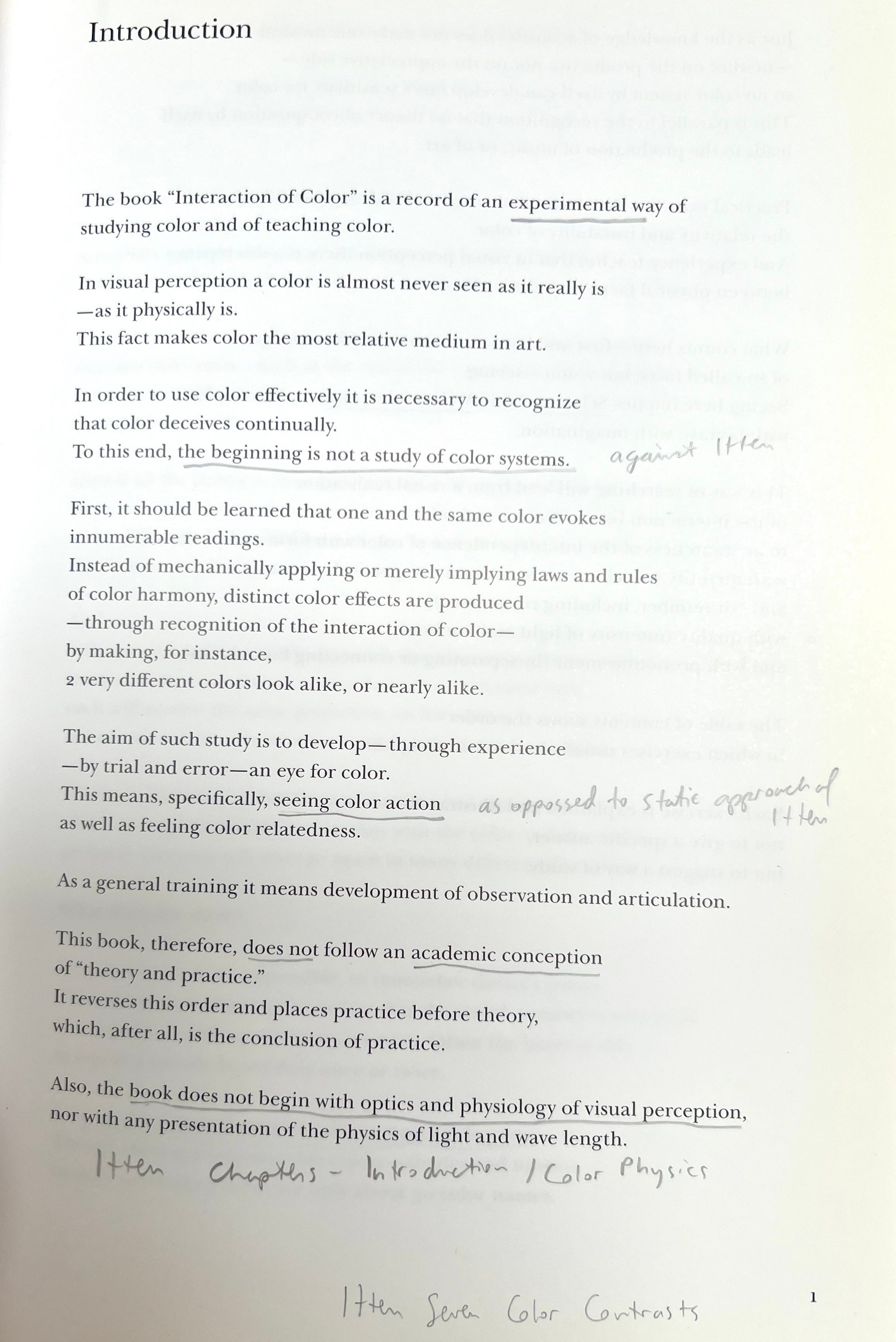
The more I read the two color theory books, the more I felt I was learning mostly from Albers. Because I read the books side by side, I began to recognize where the books overlapped but also departed. I began to hear that Albers was not only talking to us but also offering a direct criticism of both Itten’s book and Itten’s approach to teaching. Specifically, Albers was pushing back on the design of Itten’s book (that’s why all of the obsessive asides about typeface and book layout that pop up in his texts) and pushing back on Itten’s willingness to wade into conjecture.
While offering helpful descriptions of the seven observable color contrasts, Itten also ventures into odd commentary. He seems to be grasping for clarity as he speculates about innate color preferences in students based on their personal appearance. This sort of biased content, clearly impacted Albers choice to limit Interaction of Color to helpful and complex examples. My realization that Albers was critiquing Itten, helped me retain the meaning and value of Albers’s lessons. Itten became a foil, and at some points he’s even a bit of a punching bag.
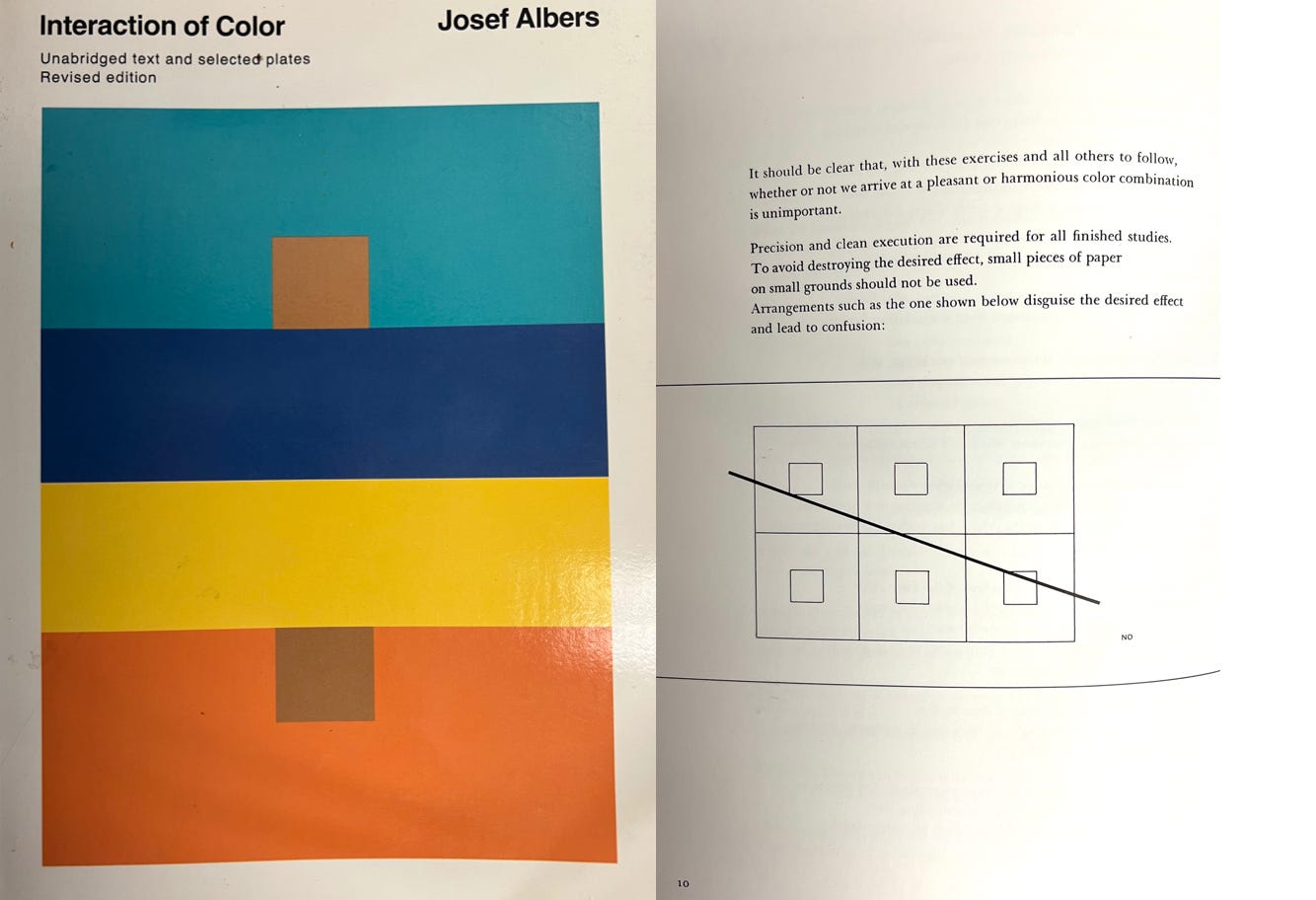
Notice below the diagram Albers is using as an example of what not to do, and then scroll back to the Itten book cover above.
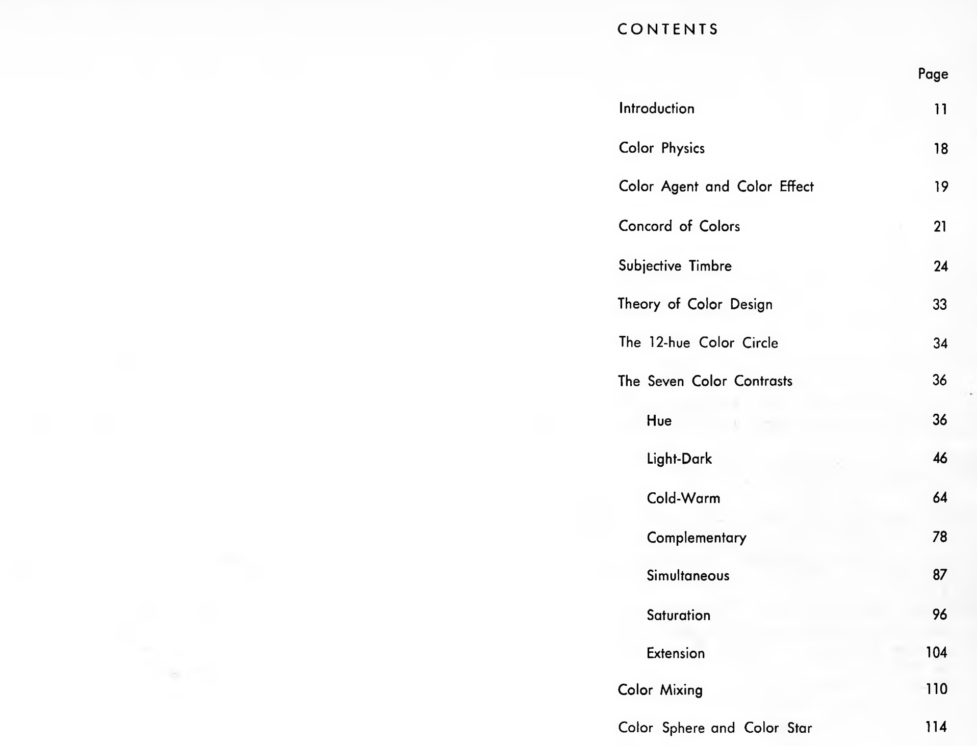
There are numerous examples where Albers is talking about either Itten’s philosophy or about Itten’s book design. Consider the table of contents of The Art of Color. It begins where Albers says not to begin. See my underlined notes at the bottom of this page.
Discovering an original first-edition of Johannes Itten’s book, The Art of Color, in the Albers Foundation library during my artist residency in 2007 confirmed what I sensed about Interaction of Color being a response, a reaction. The book I found was in German and there was a gift inscription signed by Joyce and George Whittenborne, friends of Josef and Anni Albers. Some yellow legal pad sheets were placed throughout the book with Josef’s notes in German about which parts of the text he found confusing, inconsistent or unsuccessful. Albers handwritten notes, left tucked inside of this copy of The Art of Color seem related to the final layout he used for Interaction of Color. The notes seem connected to how Albers is very careful to specify that his plates only work in certain lighting situations and that the position of his plates must be carefully considered. The extreme care Josef took with Interaction of Color feels like a reaction to his perceived failures of Itten’s attempts to get it right.
When I discovered Itten’s book at The Albers Foundation, I’m wasn’t sure if anyone had ever written about the obvious relationship between, The Art of Color and Interaction of Color. At The Foundation I was able to read through some of Josef’s typed notes about how he would layout his book, which reproductions he wanted to license for inclusion, and which student plates he would include. Luckily, I met Fred Horowitz during my residency at the Albers Foundation. He authored, Josef Albers: To Open Eyes: The Bauhaus, Black Mountain College, and Yale (2006) with Brenda Danilowitz, and in my opinion it is one of the most helpful color theory books ever written. We had some great talks about Josef’s approach to teaching and color theory. Fred sometimes taught the Albers color course using color-aid paper. Fred had never once opened a copy of, The Art of Color, and he wasn’t especially interested in Itten or the connection of the two books. He found it to be irrelevant. Why would any Albers scholar spend much time with The Art of Color, when Interaction of Color stands on it’s own so well. Brenda Danilowitz encouraged me to dig deeper and I’ve been trying to write this piece for years.
Johannes Itten (1888-1967), taught the intro color course at the Bauhaus from 1919-1923, and was briefly Josef’s teacher. After a falling out with Gropius, Itten left the Bauhaus and Josef eventually taught the intro color class. Albers fled Europe in 1933 and became a revered artist and teacher at both Black Mountain College and Yale. Nicholas Fox Weber, who worked for Josef and Anni Albers in Connecticut and is the founding director of the Albers Foundation has written extensively about both Albers and the Bauhaus and in conversations with him he made it clear to me that Albers and Itten were definitely not friends. Itten was known as a “mystic”, a hippie. Albers is frequently portrayed as very buttoned-up, even harsh, dogmatic and overly intellectual. Ironically, Itten is often accepted as the more supportive of the two approaches to color theory because Albers is more rigorous and demanding.
I’m not sure where this controlling characterization of Albers began. But it may go back to Tom Wolfe and it is clearly embedded in the current release of AI.
I asked ChatGPT “Did the author Tom Wolfe ever offer an opinion on the teaching of Josef Albers?”
Yes, Tom Wolfe did offer an opinion on the teaching of Josef Albers, specifically in his well-known essay "The Painted Word", which was published in 1975 as part of a collection of essays. In this essay, Wolfe critiques the development of modern art, particularly the shift towards abstraction, and the role of intellectuals and art critics in shaping its direction.
While Wolfe doesn't focus exclusively on Albers, he does touch upon the broader influence of figures like Albers and the rise of formalist theory in art education. His critique of the Bauhaus and its legacy includes a commentary on the way artists and educators like Albers focused on formal elements (such as color theory, composition, and geometry) at the expense of emotional or expressive content. Wolfe was critical of the tendency to prioritize intellectualized, "academic" approaches to art, which he felt made art more inaccessible and detached from the broader public.
In the context of Albers’ teaching—particularly Albers' emphasis on the scientific and perceptual aspects of color interaction—Wolfe was skeptical about how these teachings might have contributed to the rise of a kind of artistic elitism. He saw the emphasis on formalism as a way of distancing art from the human experience, focusing on technical, intellectual systems instead of emotional or narrative content.
Wolfe's viewpoint, in essence, critiqued the over-intellectualization of art, and he viewed figures like Albers, who were promoting these formalist theories, as part of a larger trend that alienated the public from art. This doesn't mean he dismissed Albers' contributions entirely but rather used him as part of a critique of how modern art education had evolved into something that was more about intellectual theory and less about direct engagement with the visual or emotional aspects of art.
So, while Wolfe didn’t offer a detailed analysis of Albers’ specific approach to teaching color theory, his criticism of modern art education and its intellectualization would certainly include figures like Albers, who were central to the Bauhaus and the emphasis on formalist, perceptual exploration in art.
Ultimately, what I find most interesting is that after Albers had painstakingly designed one of the most generous, comprehensive and successful approaches to teaching color theory, he remains mischaracterized as an intellectual or an enemy of emotion and expression. He is in fact the standard bearer of the pursuit of being alert, sensitive, and informed. All qualities that empower any devoted artist to find their expressive path.
Josef McEhleny is the only writer I have found to also carefully articulate the difference of intent between the Itten book on color and the Albers book on color. In his Artforum review he does a wonderful job of explaining much of what I have also tried to explain.
NEWS
“Giant Paintings from New England, California and Newfoundland” will be on view at 425 Market Street in San Francisco, March 17-May, 30, 2025.
Upcoming exhibition “Small Paintings” at Galerie Mercier, Paris, May 20-24, 2025.
Group show at The Glass House Fundraiser in New Canaan in June.
Group show at Cape Cod Museum of Art in Dennis, MA in July.
September solo exhibition at Truro Center for the Arts, Truro, MA.
Click here to see all of the new notecards including Paris, San Francisco, Amalfi, Newfoundland, Race Point, North Truro, Maine.
Notecards are also available in person at Explore Booksellers in Aspen, Keplers Books in Menlo Park, Provincetown Art Association and Museum, SFMOMA and University Art In Redwood City.
Thank you for this piece. I’m grateful that Allan Stone gave you the honest evaluation of your work at that point in your life—and grateful you pressed deeper into the exploring the phenomena of color, which is ongoing.
I’m also kind of obsessed with Josef Albers’ use of line and line weight (evident in his black and white prints) and sense of dimension and space. I worked with Malcolm Grear for many years, and he often talked about Albers’ use of line to create “active” form and space. Malcolm would say, “theory is thin soup.” Meaning that your actual experience of visual phenomenon such as color, line, form, space, etc., in the given situation is more meaningful than any dogma, rule, or theory.
Just curious - what are your views on the Munson Color System? I'm teaching a color course and I'm currently buried in Albers book. But friends keep telling me Munson is the key, and he developed his system before Albers! I'd love to know what you think about Munson's system in comparison to Albers. Thank you!